[01] Case Study
James Harden Vol. 6
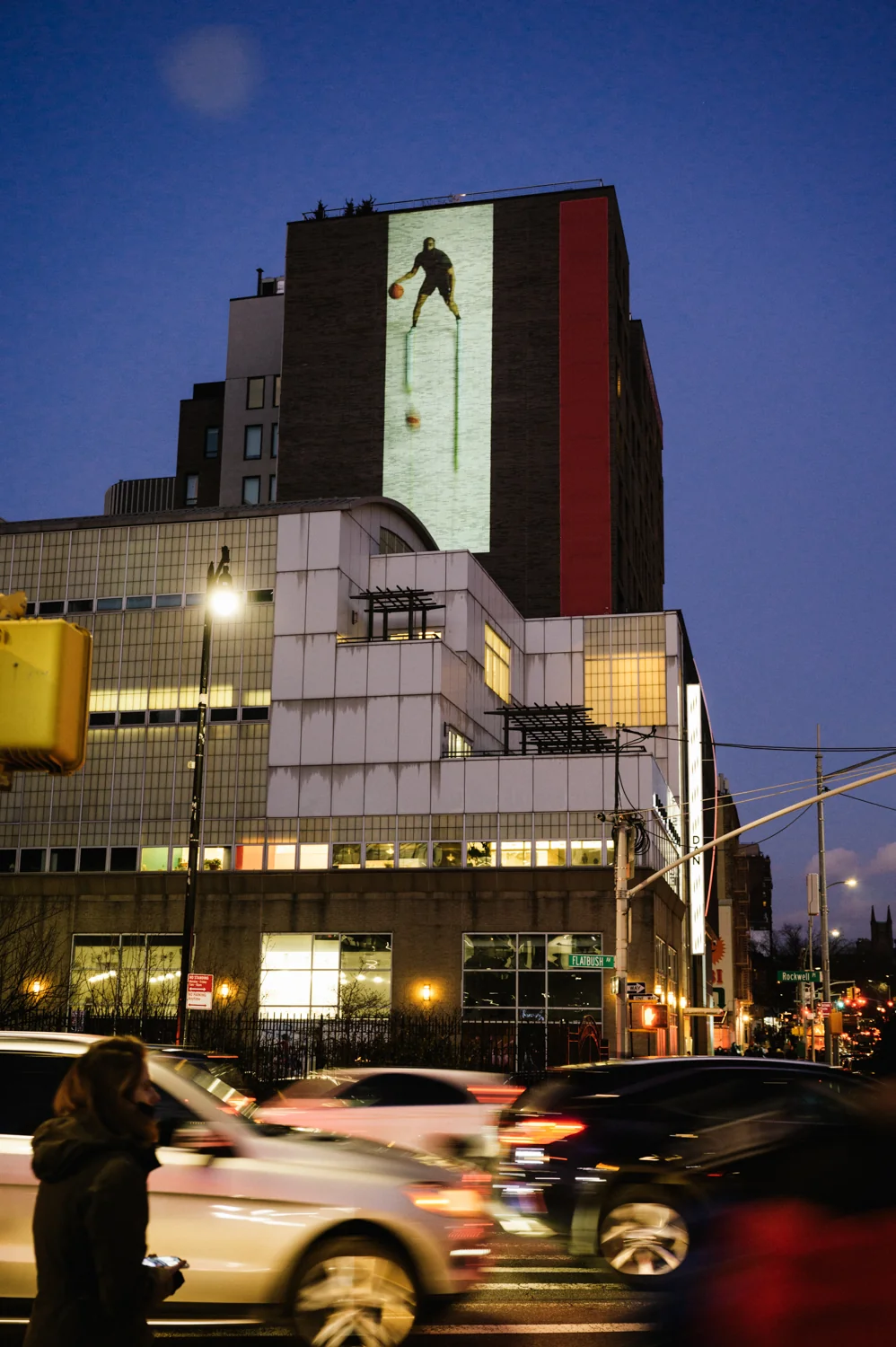
A projection-based public art activation for the Vol. 6 launch across six locations around the Barclays Center (Brooklyn). The creative intent was not a narrative arc, but an athlete-as-icon: making Harden instantly recognizable from the street through bold silhouette, rhythm, and brand-coded motion.
[02] Quick Facts
[03] Creative Intent
The piece wasn’t built around a story structure. It was built around iconography: Harden as a singular, unmistakable presence. Every visual choice was evaluated for distance-read, rhythm, and recognizability.
Silhouette first. Motion second. Detail last. If it doesn’t read from the street in one glance, it doesn’t belong.
[04] Visual System
Athlete-as-icon, built with rhythm
Instead of “beginning-middle-end”, the system cycles through recognizability layers: bold icon → kinetic energy → product moments. The goal is to keep attention in a busy street environment while staying brand-clear.
[05] Activation Context
The work was deployed as an urban activation around game-night foot traffic. The visual language needed to be loud enough to cut through city noise, but structured enough to feel intentional and premium.
High contrast, large shapes, and simplified motion so the piece holds up in peripheral vision and from moving viewpoints.
A tight palette and rhythmic motifs to keep the Adidas / Harden identity consistent across multiple locations.

[06] What Viewers See
A building-scale portrait of Harden: instantly recognizable, rhythmically alive, and punctuated with Vol. 6 product moments. The piece reads in seconds, but still rewards longer viewing through layered motion.
You get the headline: Harden’s icon + energy + the Vol. 6 launch. No narrative required.